The Company's appearance
Visual Identity
Whether your business is new, or has existed for years, a lot of energy has undoubtedly been invested in reaching the current point of development. From plans and team to financing and execution, it takes major effort to drive the momentum of a business. Wouldn't it be a pity not to take the comparatively small extra step of making it look the part? Compared to everything that goes before it, the visual identity is a low-hanging fruit, and there is no reason not to pick it. You have spent thousands of hours building a professional company, it's time to make it show!
Obviously, it also has a significant impact on the potential for growth. If you are a butcher, looking like a green grocer is counterproductive - it means that customers looking for a butcher won't spot you.
Logo, colors, fonts and pictures
It all comes down to having a visible - or visual - identity: Being able to see what to expect from your business at a glance. The identity should also be aligned with the business strategy, and must support the planned development and the values of the company. And of course it has to look good!
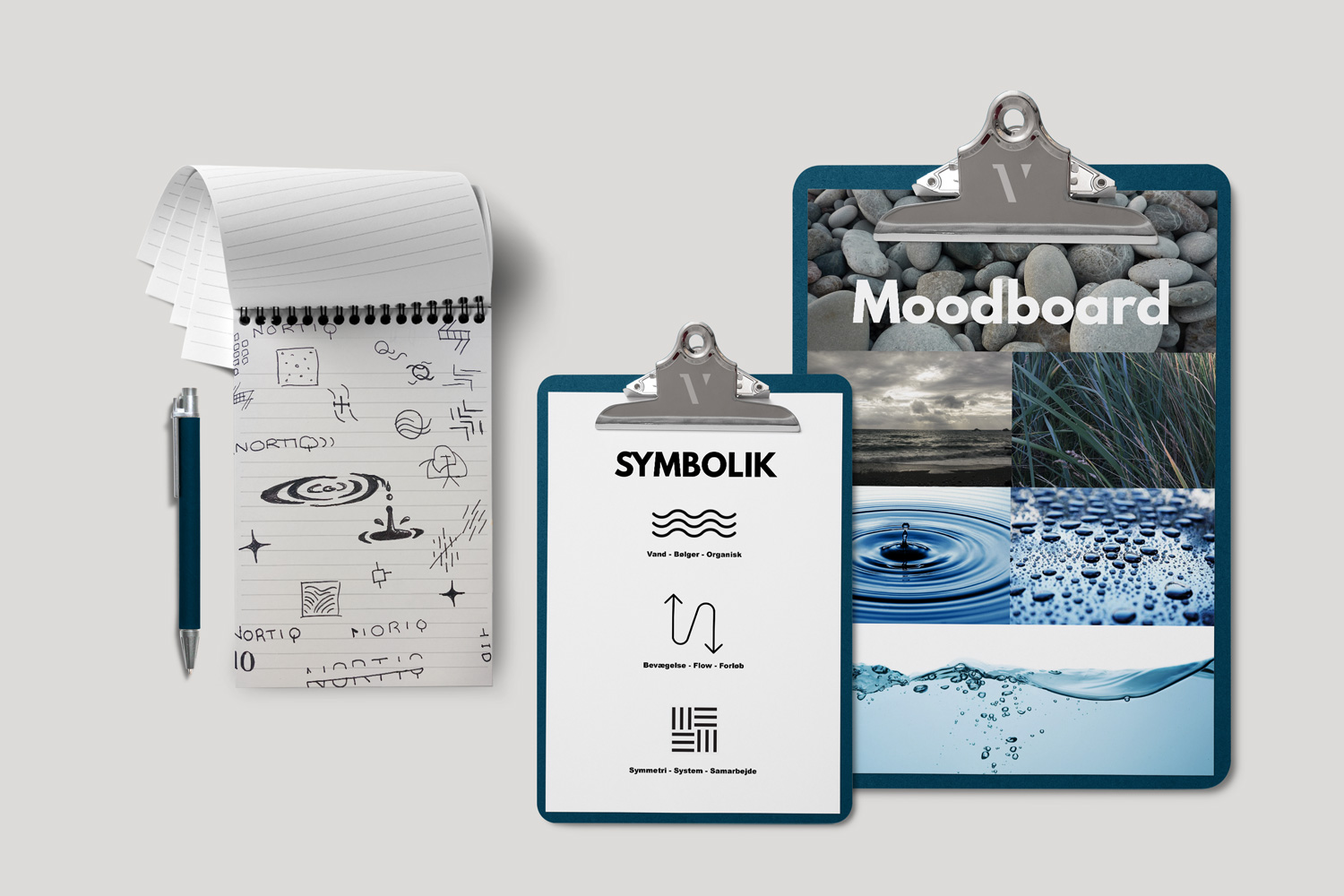
The process therefore has to start with gathering the elements related to the business and strategy. A good identity shouldn't just be applicable to a wide range of touch points - from letterheads and websites to the side of a building - but also lend itself to meaningful unfolding. This applies to both the actual visual content, and the symbolism represented by the elements.
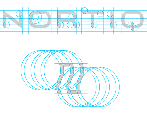
Having established the right mood and selected which elements are relevant, we can begin creating a visual design language and expression. Do we want a formal or casual style? Which geometry are we using, and how does it replicate? How are we using colors, patterns or gradients? And not least, what does this brand need to to in practical terms - where are we going to apply it? This question points us towards the next step in the process.
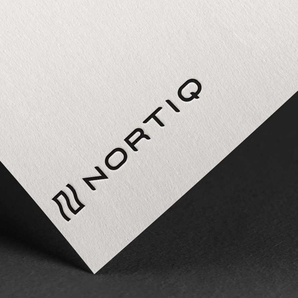
Design Guide
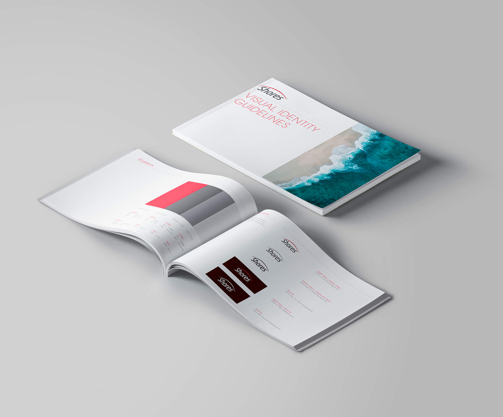
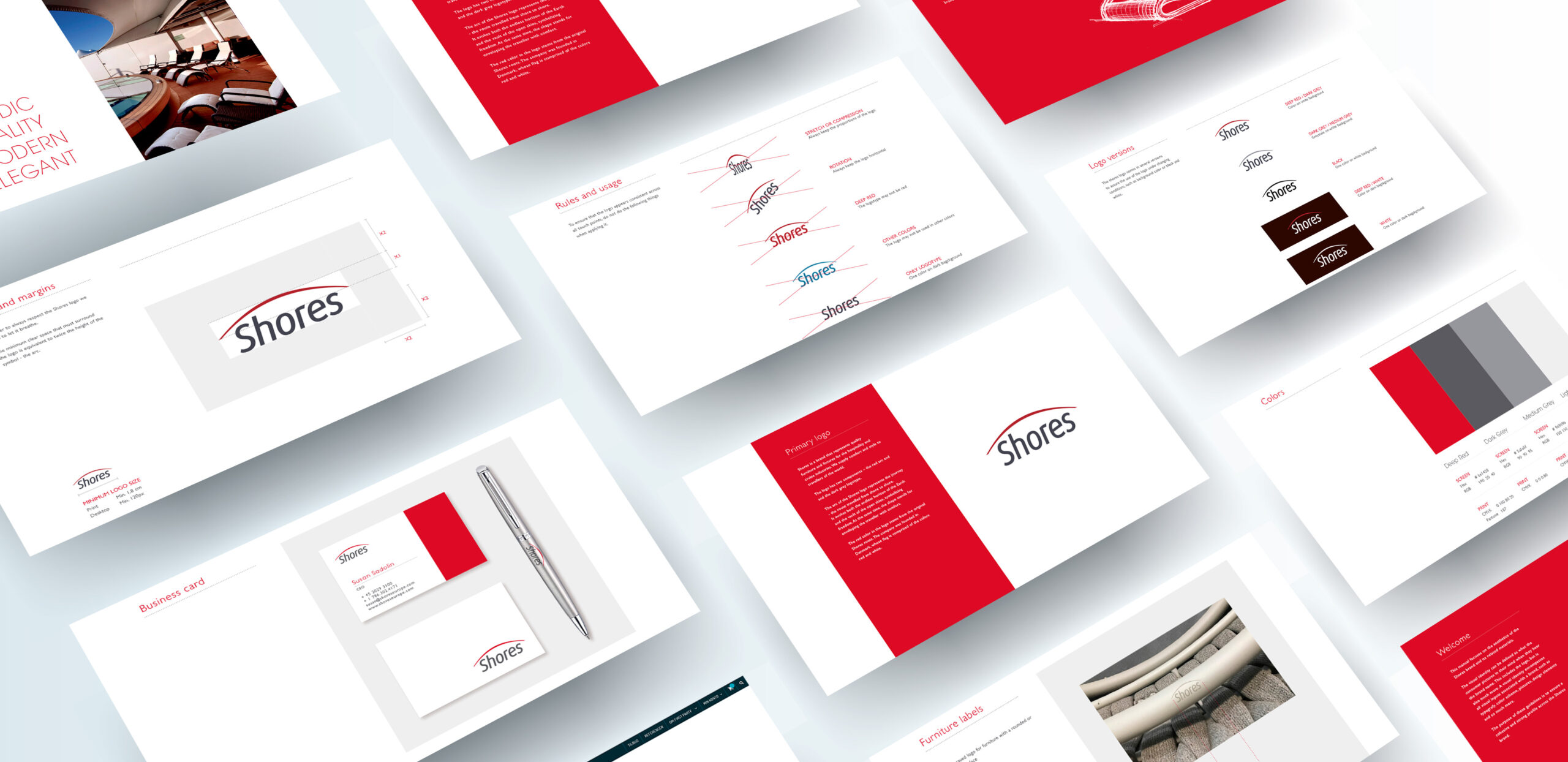
The right identity has to be put to the right use. To ensure the best possible results under the many different circumstances that may come into play on an everyday basis, a design guide is produced, describing the principles of use - and non-use - for the logo, colors and other design elements. With this you don't have to get the graphics artist to create a whole new design every time a new touch point is made, or when managing various vendors producing materials sporting the identity elements.
Recognizable everywhere
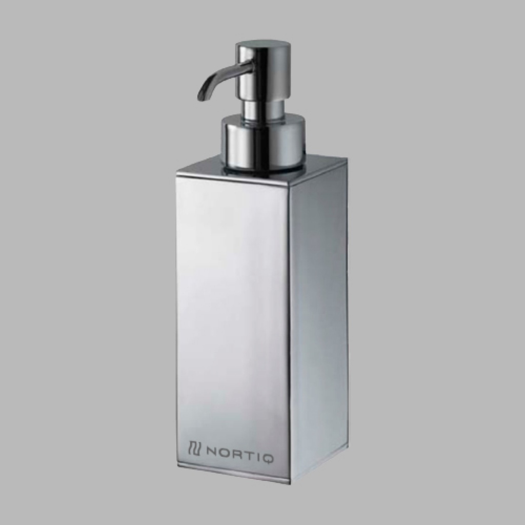
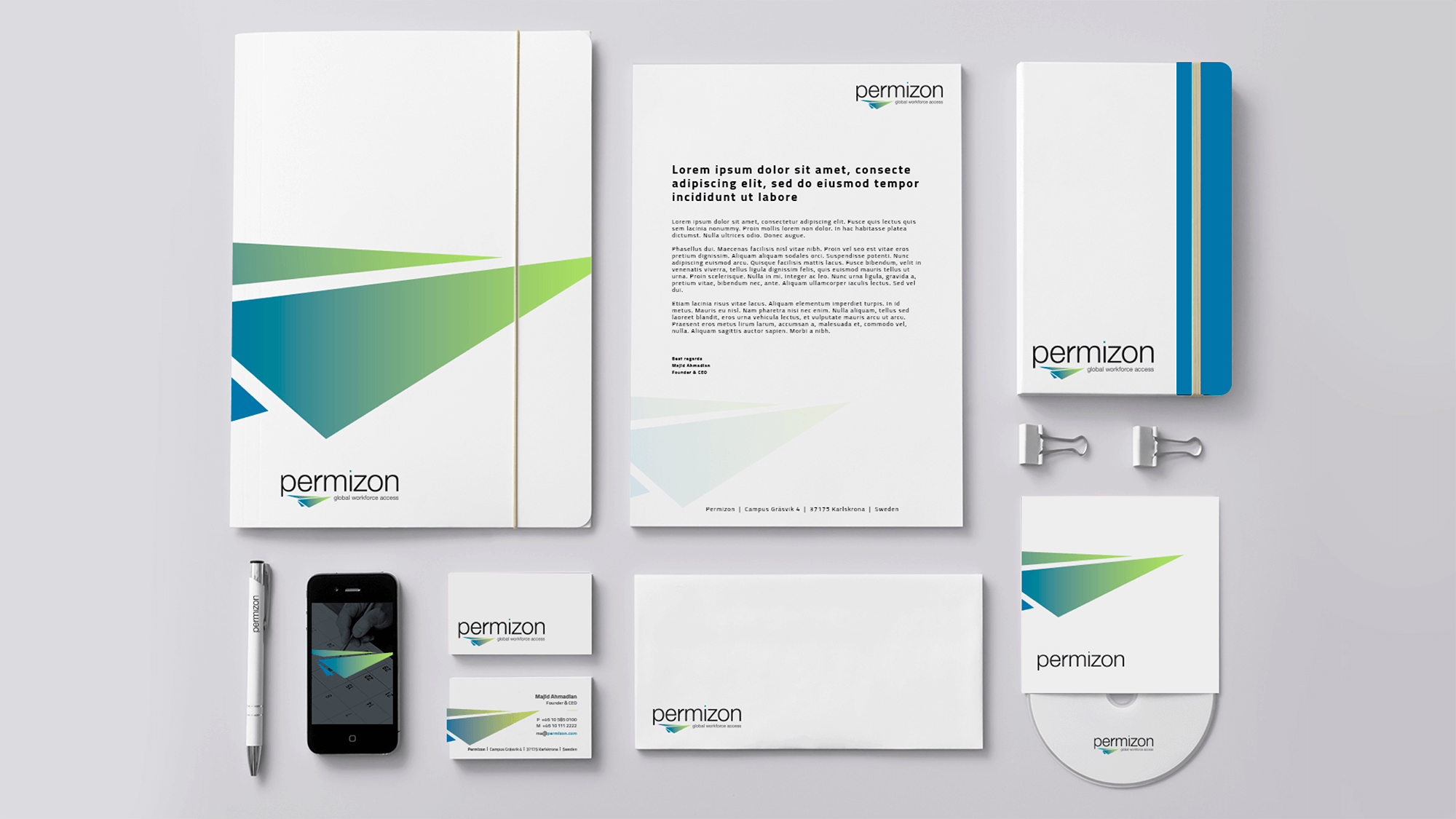
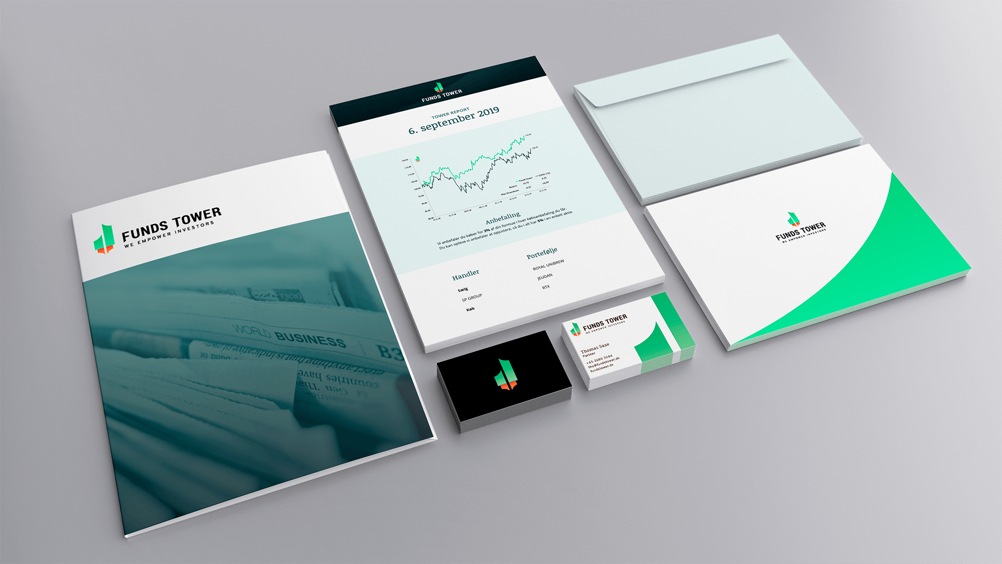
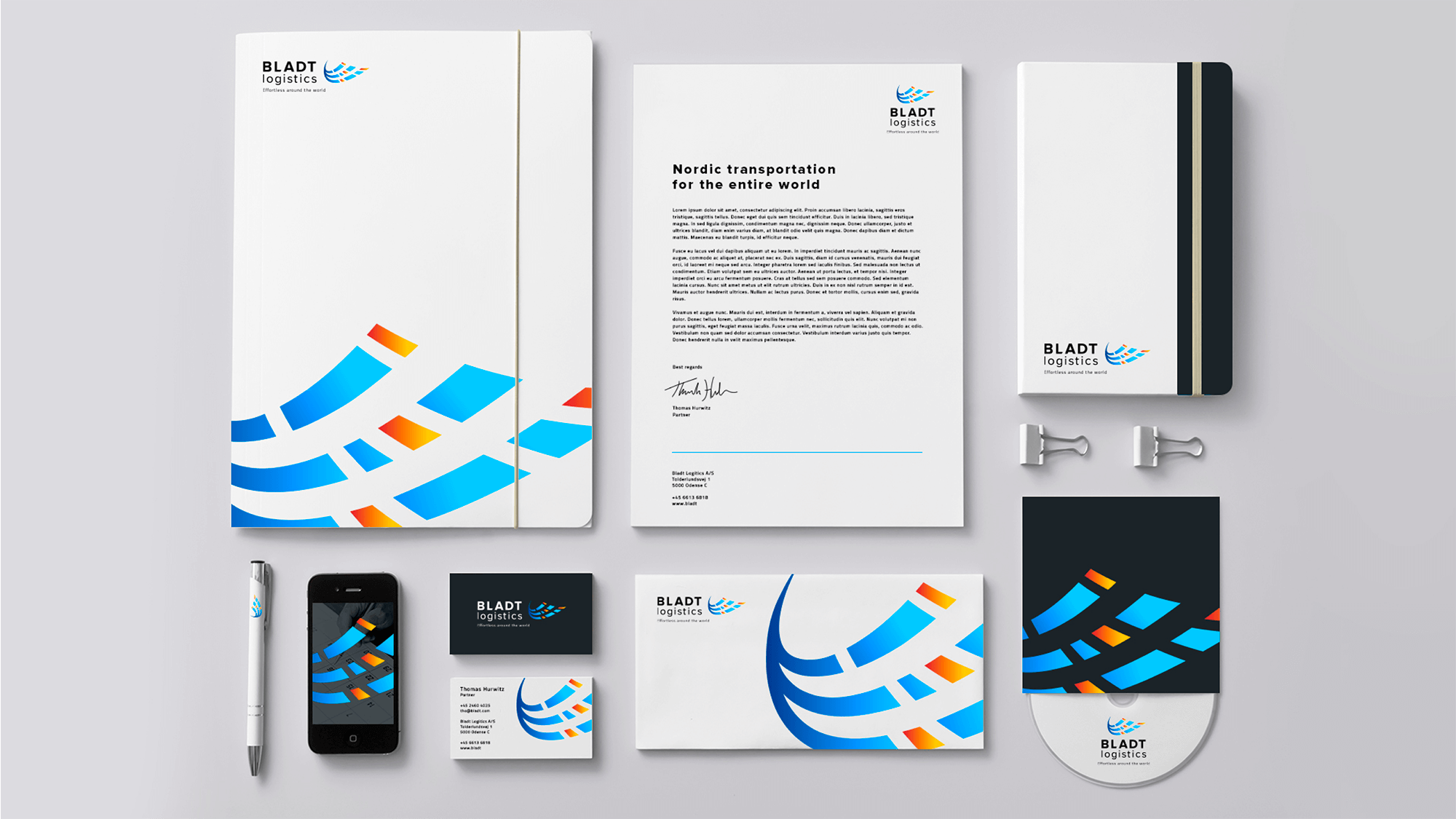
Having chosen a design as the company's visual identity means this is the appearance and expression meeting both customers and employees anywhere they encounter the business. Therefore, the identity is applied to all relevant touch points. That may be the common sundries like business cards and pens - but there may be other, particularly relevant elements for your company. Do employees wear uniforms or work clothes, or use tools? Do you need quote folders or note books? Which digital platforms are you on?
Outward facing
This may sound like a major project, so let us just repeat: Compared to everything it took to build your business to where it is right now, creating a visual identity is actually quite manageable. Especially if you find the right collaboration partner, capable of executing the process in the spirit of your business. We have done this many times - and we are ready to help you, too!


